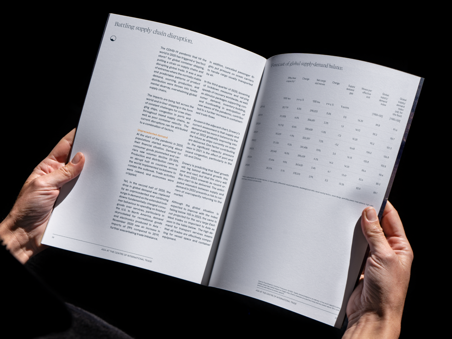
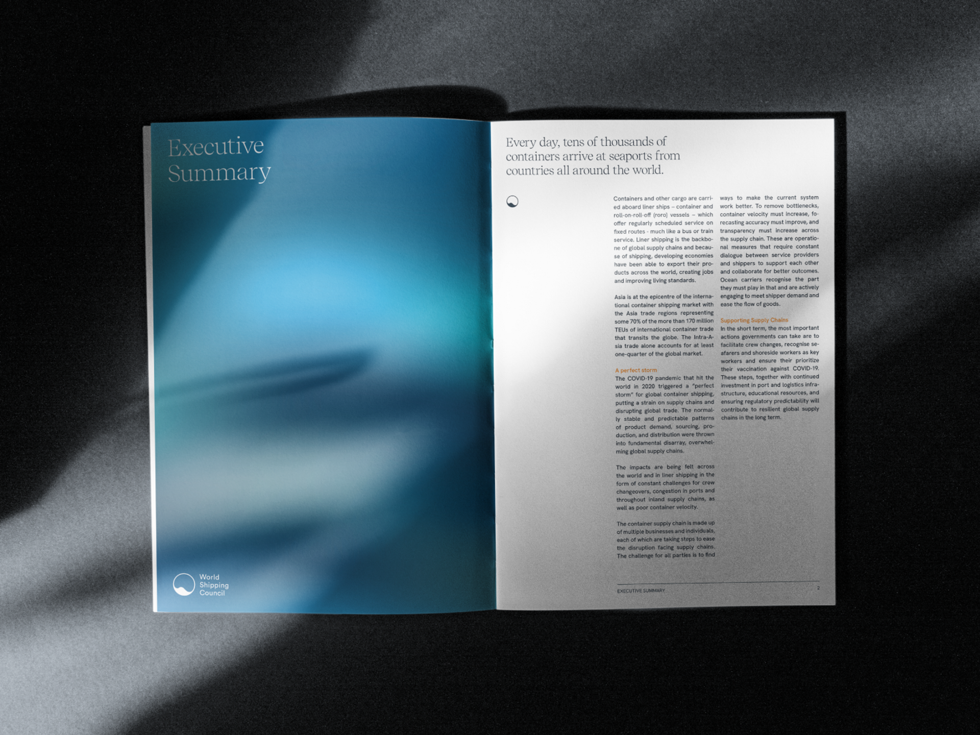
World Shipping Council
Rebranding the sustainable, safe, and secure liner shipping industry.
World Shipping Council is working with policy makers and industry groups to shape the future growth of a socially responsible, environmentally sustainable, safe, and secure shipping industry.
It was formed in 2000 to collaborate with governments and other stakeholders on actionable solutions for some of the world’s most challenging transportation problems.
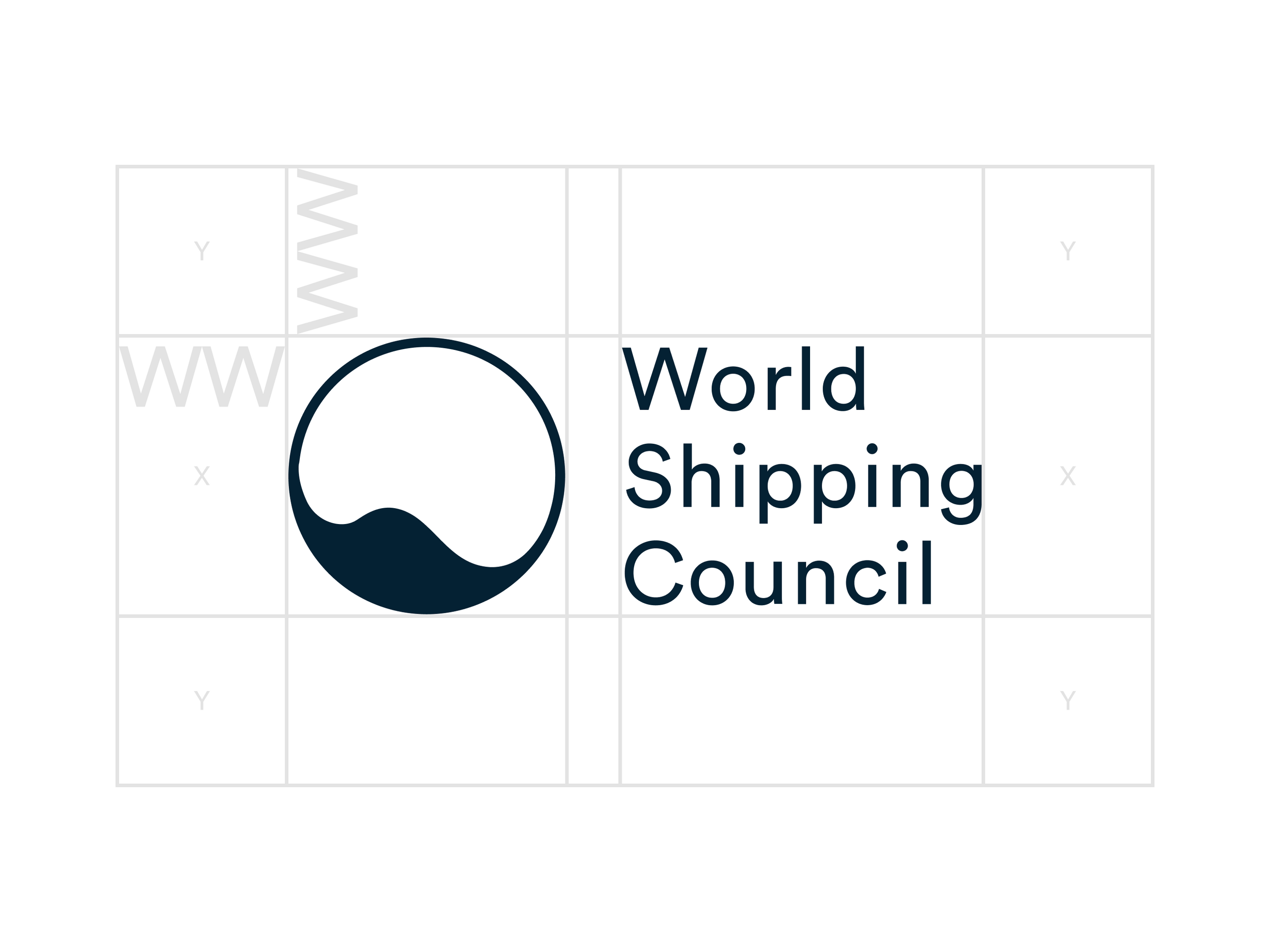
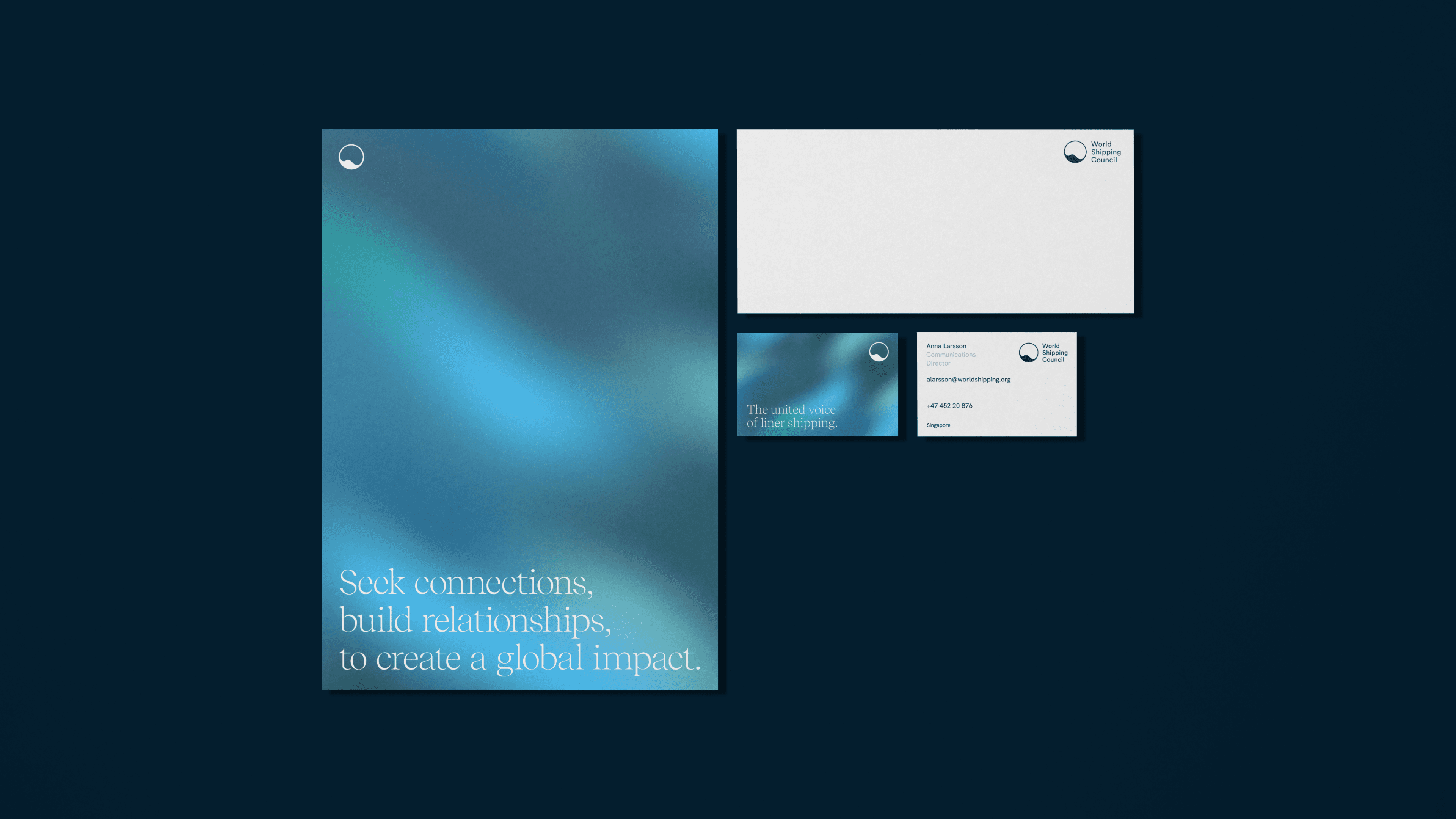
The visual identity focuses on a simple, clean, and bold wordmark built on the dualistic approach of looking at the globe and the ocean as one.
World Shipping Council is leading the way to build a more sustainable and safer blue economy, working for sound regulation to help drive progress across the maritime industry for the environment and all those working in the global supply chain. This approach was at the core of the organization's new branding: looking at the globe and the ocean as one and highlighting the individual seafarer – all cornerstones of liner shipping.
A symbol of unity.
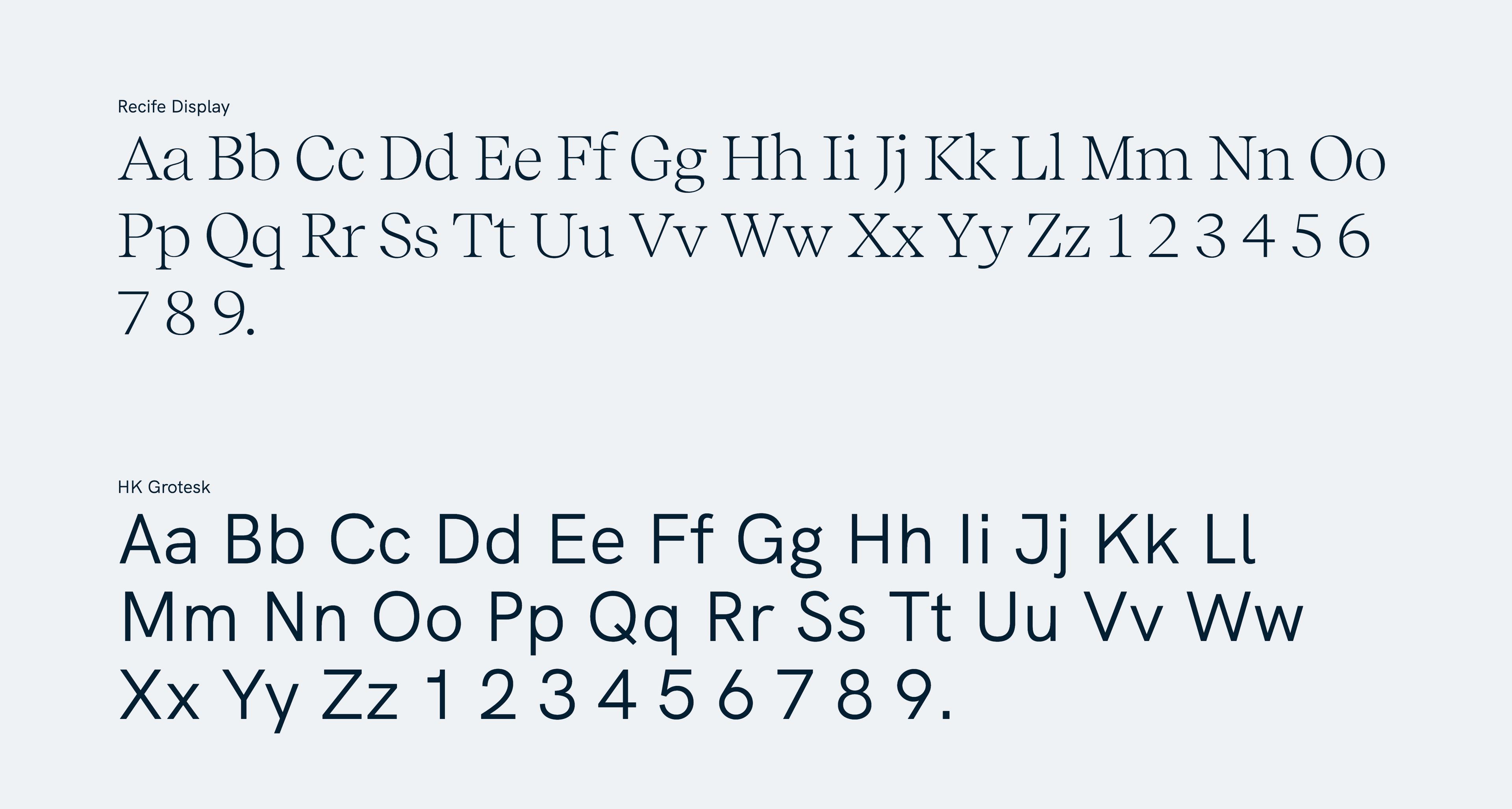
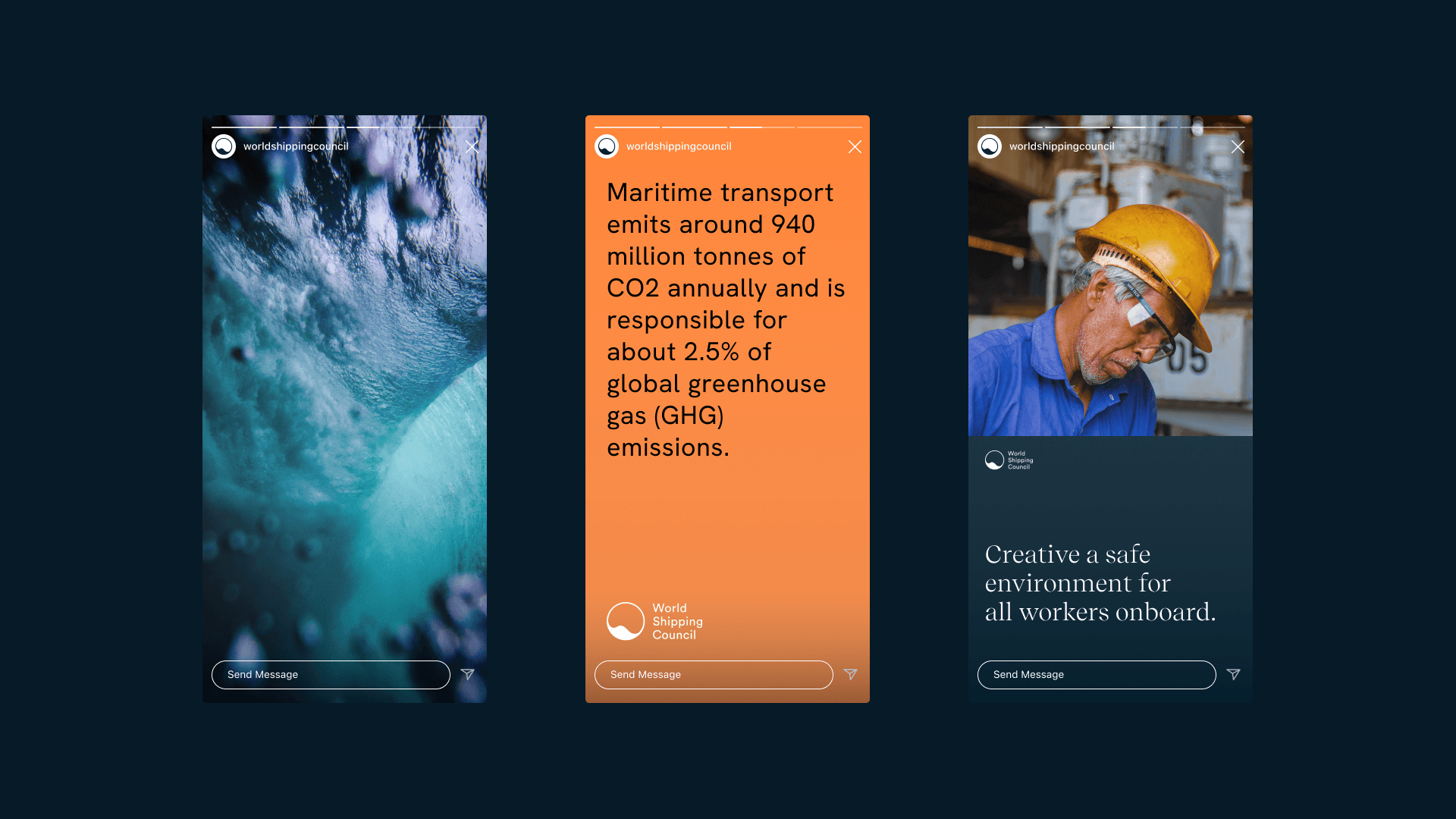
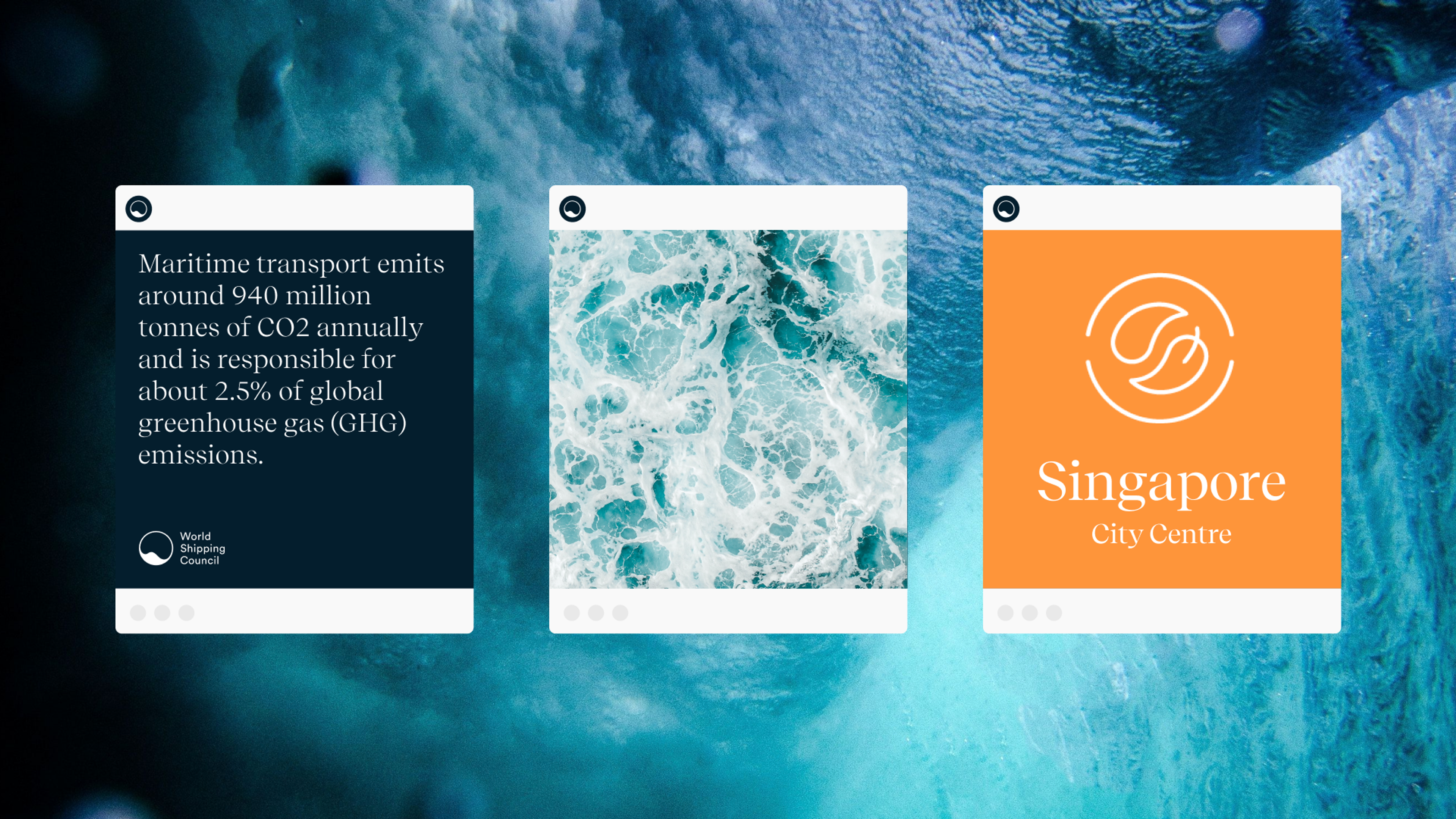
Typography supports the communication strategy centered around keywords: reachable, nuanced, visionary, fact-based, and inclusive. The brand messages are brought to life by using two different fonts; one sans serif and one display serif.
These two work together to create depth and texture to the content HK Grotesk, the Sans is used for body text and short annotations. Recife display, the Serif, is used for running text and longer paragraphs due to its readability. Together they create a fine balance of minimalism and elegant movement, like the ocean.
The colors used for the identity are handpicked to communicate the brand’s values and beliefs.
They represent materials on ships, the softness of the human touch with the orange tones and the green complements, finalizes, the color palette embracing more earthy tones that reflects the climate focus purpose.

